When cleanliness and aesthetics meet
The Ultimate Goal
The “Carpentry Concept” is an upscale, boutique carpentry shop that crafts woodwork of the highest standards, with an emphasis on the unconventional.
The primary objective is to design an innovative and visually appealing website that prominently displays carpentry work.
The Challenge
The challenge is to understand how I can attract the attention of professionals who deal with design (interior design or architecture) and make the business stand out from its competitors.
User characteristics
Research for the website project began with the task of refining the target audience. Unlike many carpenters, our target market was interior designers and architects, rather than private clients.
As a result, it was crucial that the website should give off a distinguishing aura of innovation and professionalism that would appeal to those who have an eye for design.
In order to identify the most important aspects to highlight, I sent out a jobs-to-be-done questionnaire to several interior designers and architects who best represented our target audience.
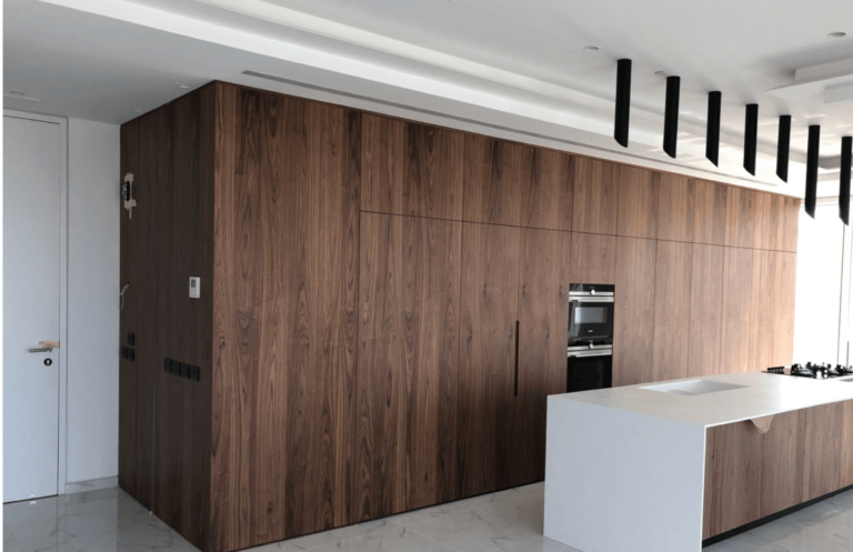
From the survey I learned that it’d be best to emphasize larger-scale projects, specifically around TV walls and kitchens. On the other hand, I discovered that highlighting existing kitchen renovations and construction of complementary furniture (closts, libraries, etc.) would be less impactful.
The inner pages have a clean design, and pay homage to every project.
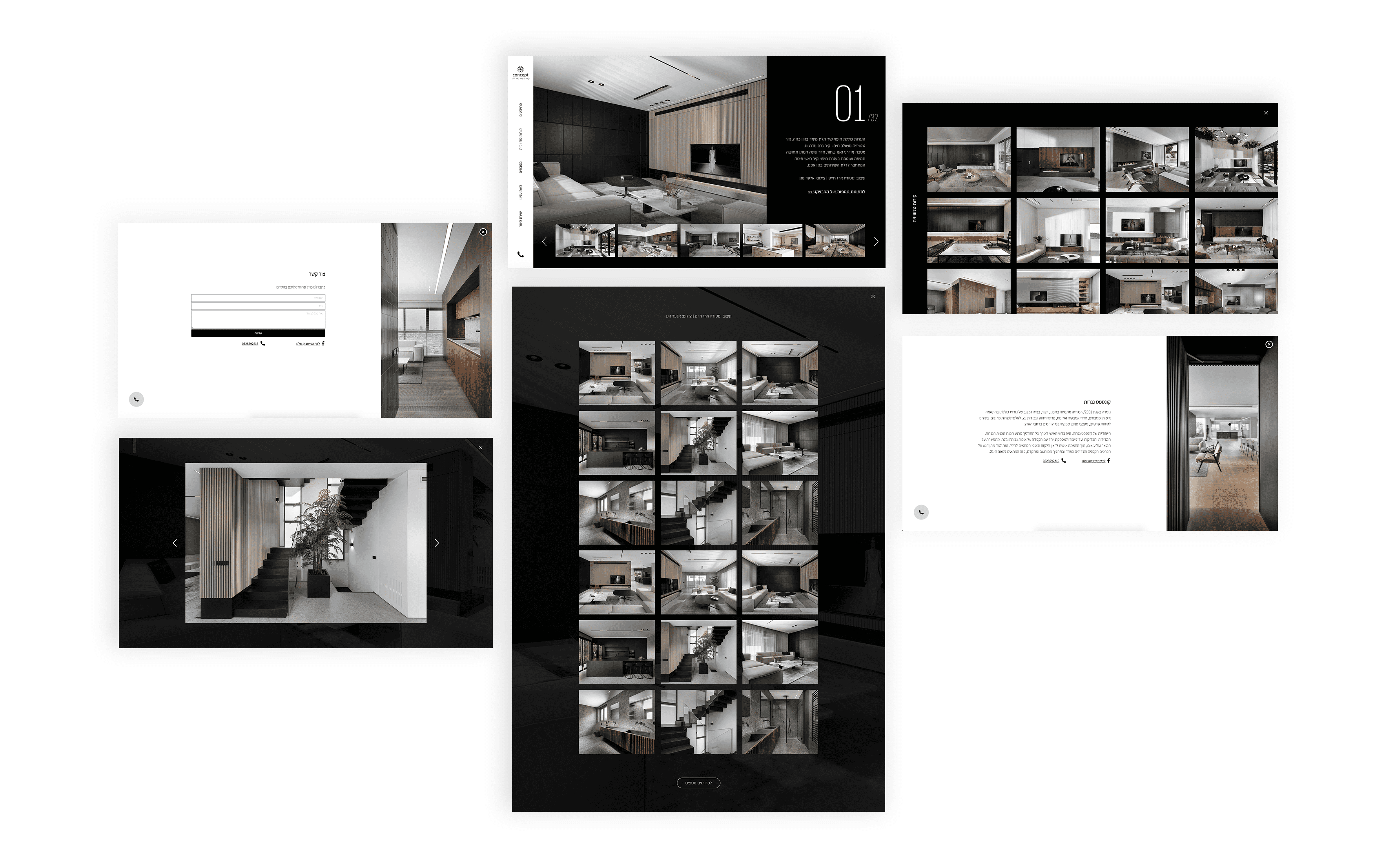
Finally, our survey results told us the importance for customers to get a sense of the carpenter’s experience — and that the best way to demonstrate this was to show a large amount of quality work. Based on this, we emphasized the number of projects (01) in the photos section. As a finishing touch, we added endless scrolling to the carousel of projects to give a sense.

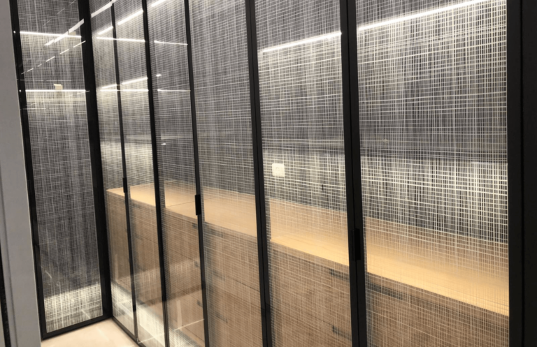
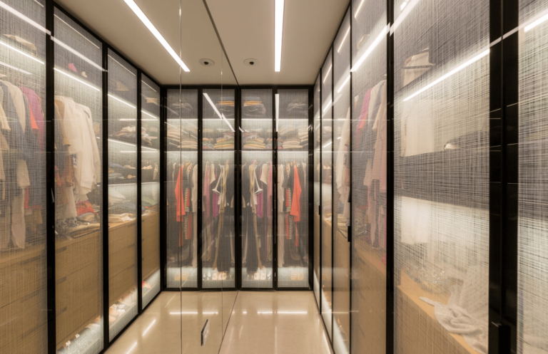
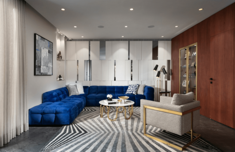
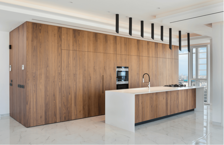
My involvement in this project was not only limited to design, but also around the content / images that would be displayed on the site. One of the most eye-grabbing things one can do to improve a website’s conversion rate is to include high-quality imagery of previous work, and I insisted we do so. For any projects that weren’t professionally photographed, we hired a photographer to re-take high-quality pictures to highlight carpentry work done.


When cleanliness and aesthetics meet
The Ultimate Goal
The “Carpentry Concept” is an upscale, boutique carpentry shop that crafts woodwork of the highest standards, with an emphasis on the unconventional.
The primary objective is to design an innovative and visually appealing website that prominently displays carpentry work.
The Challenge
The challenge is to understand how I can attract the attention of professionals who deal with design (interior design or architecture) and make the business stand out from its competitors.
User characteristics
Research for the website project began with the task of refining the target audience. Unlike many carpenters, our target market was interior designers and architects, rather than private clients.
As a result, it was crucial that the website should give off a distinguishing aura of innovation and professionalism that would appeal to those who have an eye for design.
In order to identify the most important aspects to highlight, I sent out a jobs-to-be-done questionnaire to several interior designers and architects who best represented our target audience.
From the survey I learned that it’d be best to emphasize larger-scale projects, specifically around TV walls and kitchens. On the other hand, I discovered that highlighting existing kitchen renovations and construction of complementary furniture (closts, libraries, etc.) would be less impactful.
The inner pages have a clean design, and pay homage to every project.

Finally, our survey results told us the importance for customers to get a sense of the carpenter’s experience — and that the best way to demonstrate this was to show a large amount of quality work. Based on this, we emphasized the number of projects (01) in the photos section. As a finishing touch, we added endless scrolling to the carousel of projects to give a sense.

My involvement in this project was not only limited to design, but also around the content / images that would be displayed on the site. One of the most eye-grabbing things one can do to improve a website’s conversion rate is to include high-quality imagery of previous work, and I insisted we do so. For any projects that weren’t professionally photographed, we hired a photographer to re-take high-quality pictures to highlight carpentry work done.


When cleanliness and aesthetics meet
The Ultimate Goal
The “Carpentry Concept” is an upscale, boutique carpentry shop that crafts woodwork of the highest standards, with an emphasis on the unconventional.
The primary objective is to design an innovative and visually appealing website that prominently displays carpentry work.
The Challenge
The challenge is to understand how I can attract the attention of professionals who deal with design (interior design or architecture) and make the business stand out from its competitors.
User characteristics
Research for the website project began with the task of refining the target audience. Unlike many carpenters, our target market was interior designers and architects, rather than private clients.
As a result, it was crucial that the website should give off a distinguishing aura of innovation and professionalism that would appeal to those who have an eye for design.
In order to identify the most important aspects to highlight, I sent out a jobs-to-be-done questionnaire to several interior designers and architects who best represented our target audience.
From the survey I learned that it’d be best to emphasize larger-scale projects, specifically around TV walls and kitchens. On the other hand, I discovered that highlighting existing kitchen renovations and construction of complementary furniture (closts, libraries, etc.) would be less impactful.
The inner pages have a clean design, and pay homage to every project.

Finally, our survey results told us the importance for customers to get a sense of the carpenter’s experience — and that the best way to demonstrate this was to show a large amount of quality work. Based on this, we emphasized the number of projects (01) in the photos section. As a finishing touch, we added endless scrolling to the carousel of projects to give a sense.

My involvement in this project was not only limited to design, but also around the content / images that would be displayed on the site. One of the most eye-grabbing things one can do to improve a website’s conversion rate is to include high-quality imagery of previous work, and I insisted we do so. For any projects that weren’t professionally photographed, we hired a photographer to re-take high-quality pictures to highlight carpentry work done.
