Connect to the ground through digital
The Ultimate Goal
The "Plant A Tree" project is a mobile-optimized website aimed at encouraging tourists coming to Israel to “donate” a tree prior to their trip, and ultimately participate in the tree planting process upon their arrival.
The Challenge
Personally, my main challenge of the project was the short timeframe I had, I joined the project just before the website was about to go live.
When I first noticed the user’s experience when signing up to donate a tree, I realized that the project could lose many existing users, rapidly — even at the very beginning of the registration process, for couple of reasons:
- Too much unnecessary “noise” in every page
- Lack of organized hierarchy and messy order in what was presented
- An outdated design that conveys unreliability And most importantly, a confusing an overall frustrating user experience.
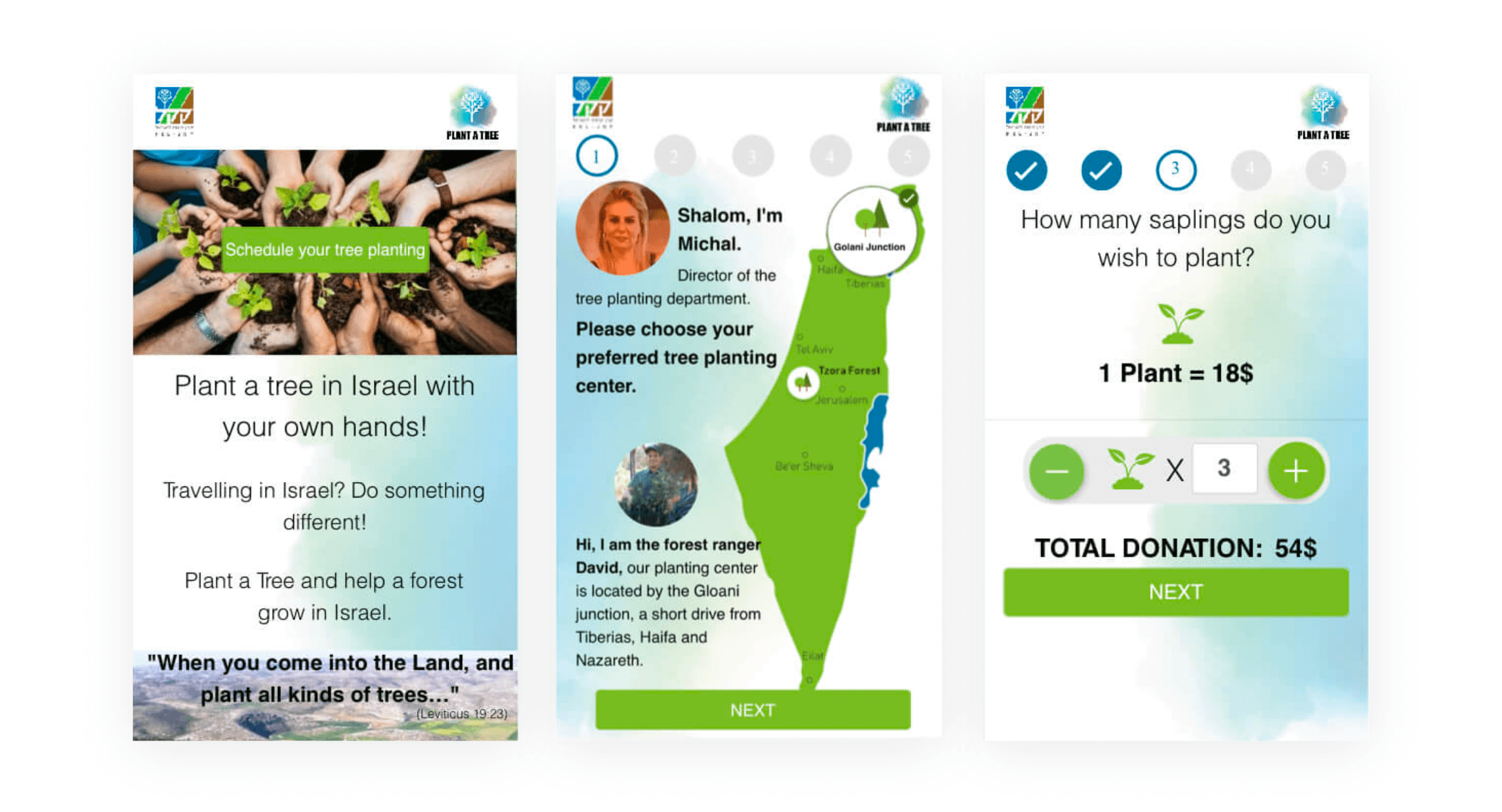
Displayed below is the original design:

Main Objectives
- Streamline the entire customer sign-up process by organizing information and buttons in an intuitive way.
- Establish credibility with users by demonstrating that the "Plant a Tree" project is affiliated with Keren Kayemet LeIsrael.
- Redesign the website with an innovative modern design
- Add more user-oriented feature to increase the user experience: personal area after purchase, language selection toolbar, redesign of the payment page
User characteristics
To get started, I needed to determine the nature of my target audience. This would then be used to guide the design of the website and the sign-up process.
People aged 30-65, with a focus on those on the older end of this range, who self-identify as Zionists and/or lovers of Israel and wish to contribute to and feel connected to the country, even from a distance.
In my research, I contacted potential users and examined their relationship with Israel and, of course, their contribution to its development. The people I contacted fell into three general buckets with their responses:
“I would like to contribute to Israel but don’t know how.”
“I come to Israel every year. It’s wonderful!”
“I’m not well-off, but if there’s any way I can help Israel within my budget, then I want to do so”
Final Design
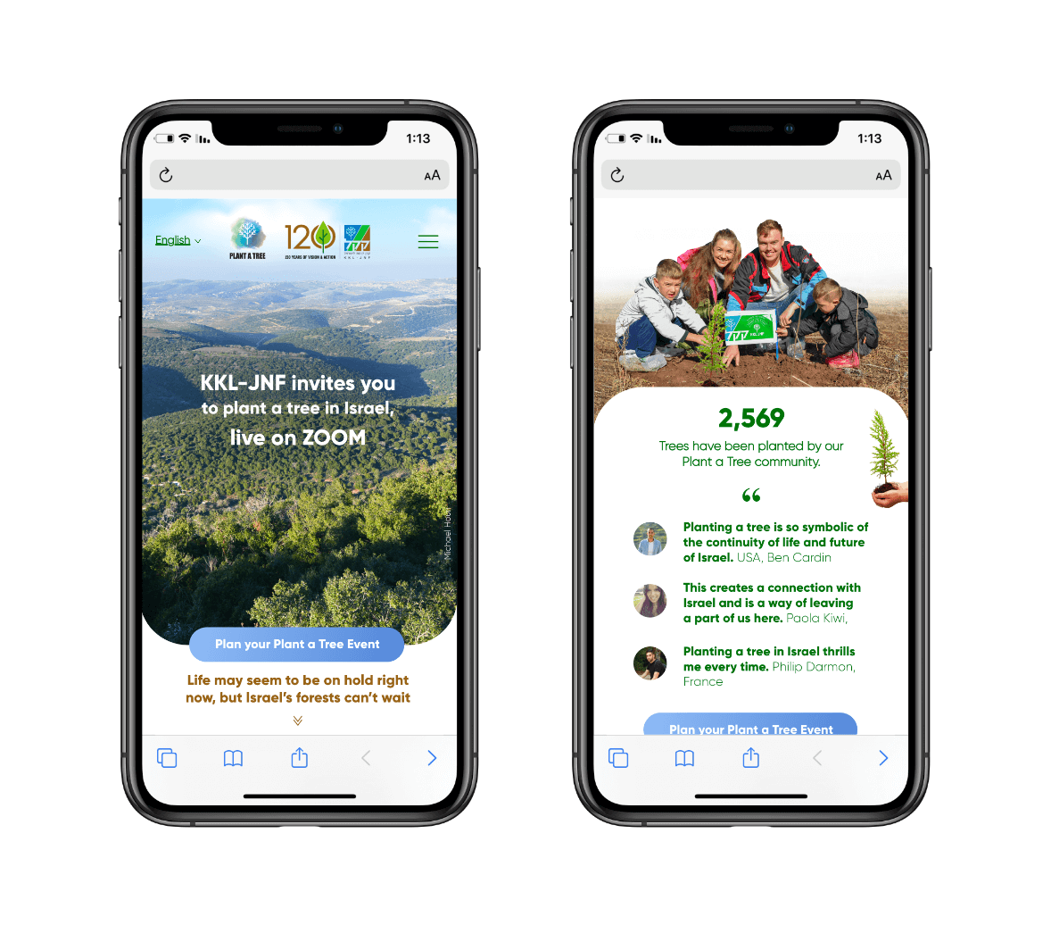
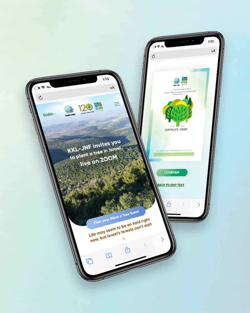
Clean and intuitive design, establishes credibility, and utilizes language consistent with the company’s brand.
Steps 1-4
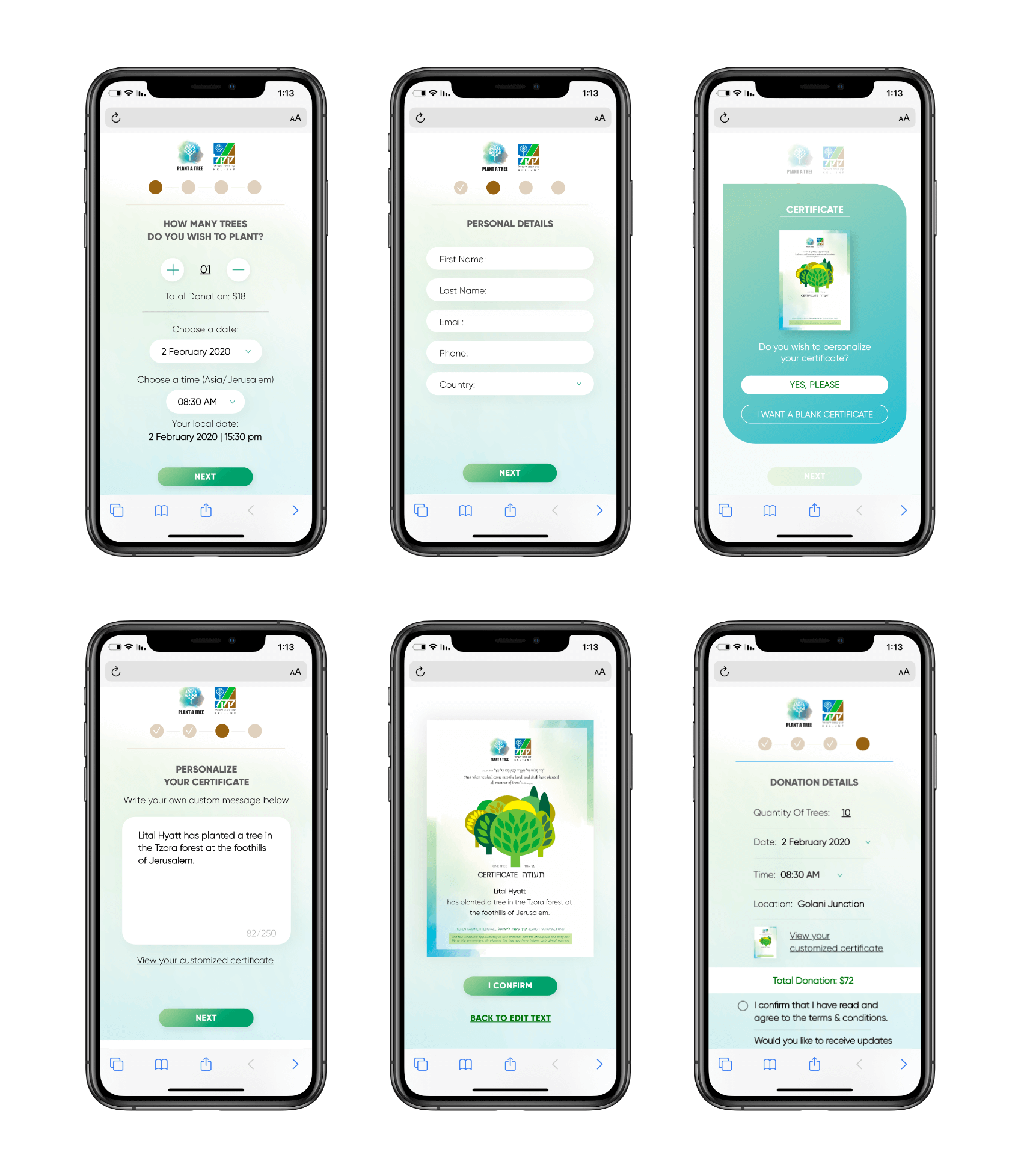
When it was decided to start the sign-up process, the user begins a simple four-step process.
During this process, the user is asked to select the tree-planting date and time, choose the number of trees they want to plant, and provide their personal information.
These tasks have been broken down into short, easy-to-complete steps to prevent the user from feeling overwhelmed and quitting before completing the sign-up process.

Payment Page
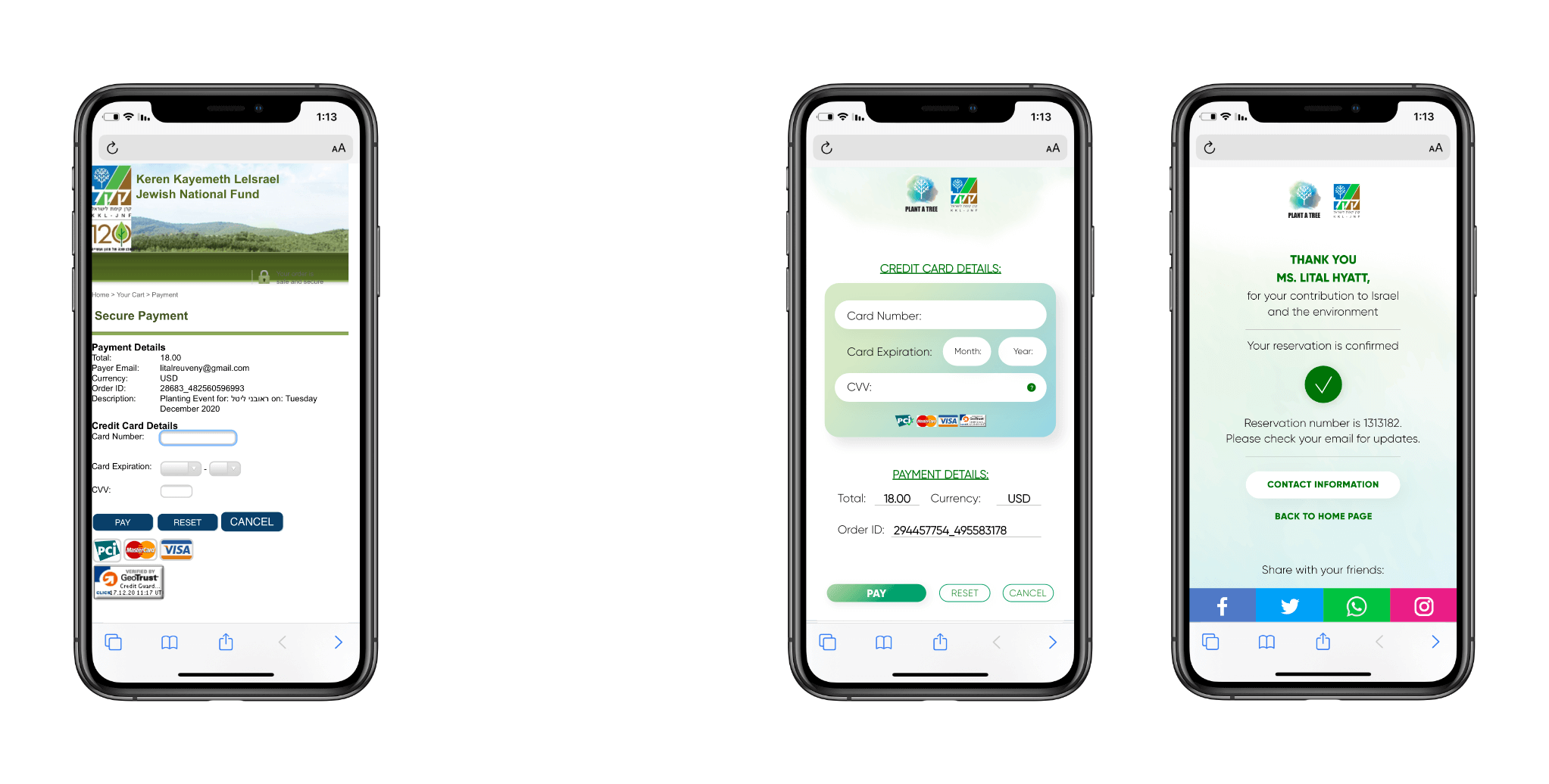
The payment page that has been used so far (on the left side) does not match the current design of the website, and was not very responsive either. A user who reaches this stage may be stressed and panic that this is a hacked and untrustworthy website. In addition, there is no differentiation between the important "pay" button and the other buttons. It seems that the "cancel" button is the main and prominent button, which may cause the user to not proceed with the payment. it was important for me to adapt the payment area to the “graphic language” and give the user a secured feeling.
Finish Page
In the previous version of that page, the user did not receive any "success" message on the website informing him that his order was approved. Instead they were just sent to the home page. This screen assures the user that the order has been completed successfully, and also provides important information that they will need without getting a feeling of uncertainty as to whether the transaction was completed or not.
New version:
Old version:
New Screens
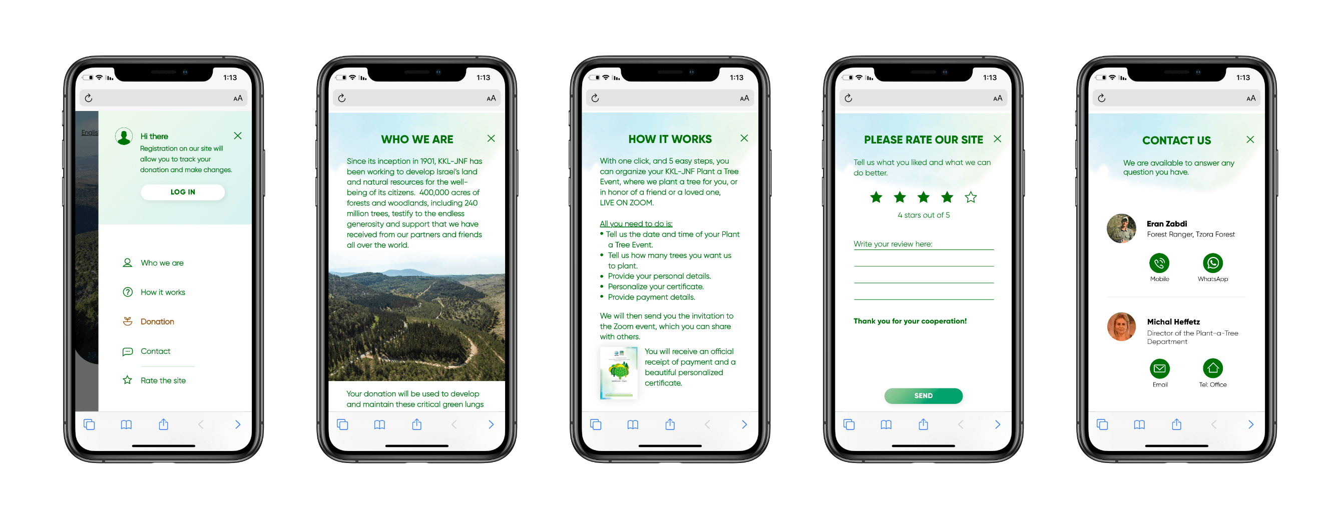
The “hamburger” menu didn’t exists, as well as the information inside of it.
Adapting the platform to the Corona period
Following the Covid-19 outbreak, changes were made to adapt to the new situation in the world. The most notable changes were that the user would not be able to come and plant the seedling themselves, so there was no need for them to choose where to plant the seedling on the website. This led me to ask for fewer details about the user, such as the number of people coming to the planting and the number of children versus adults
An example of the map presented before the corona virus:
New version:
Old version:
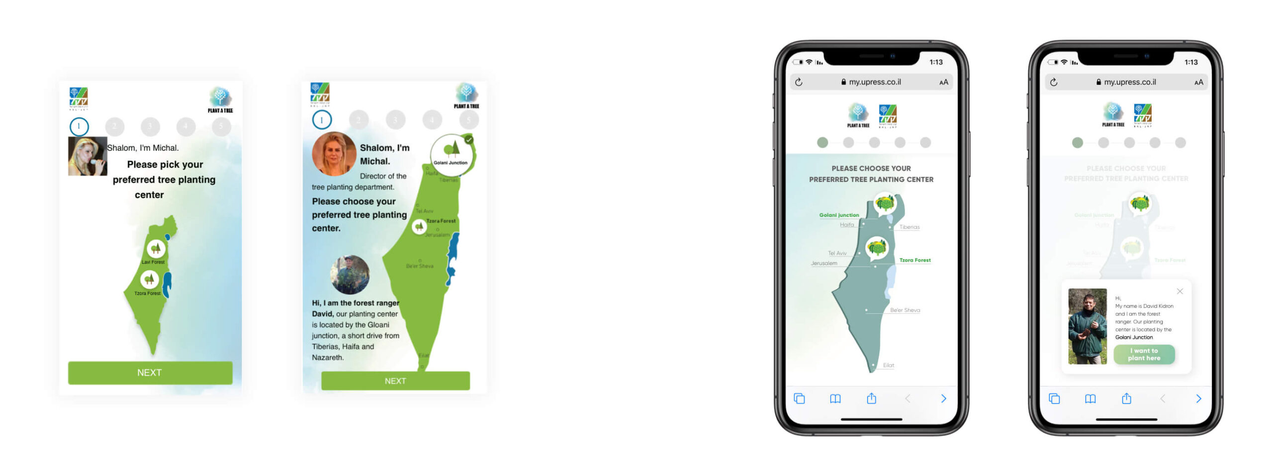
One confusing aspect of this step in the old design was the "Next" button. During user research sessions, I observed that many users would not actually read what was on the screen and would reflexively hit the "Next" button immediately. In my version of this step, I removed the "Next" button completely to focus the user on the main task at hand: selecting a tree planting center. With this change, the user more clearly understood that they needed to choose one of the two tree planting centers before moving on.
I completed this work during my time at Keren Kayemet Leisrael – Jewish National Fund.
Connect to the ground through digital
The Ultimate Goal
The "Plant A Tree" project is a mobile-optimized website aimed at encouraging tourists coming to Israel to “donate” a tree prior to their trip, and ultimately participate in the tree planting process upon their arrival.
The Challenge
Personally, my main challenge of the project was the short timeframe I had, I joined the project just before the website was about to go live.
When I first noticed the user’s experience when signing up to donate a tree, I realized that the project could lose many existing users, rapidly — even at the very beginning of the registration process, for couple of reasons:
- Too much unnecessary “noise” in every page
- Lack of organized hierarchy and messy order in what was presented
- An outdated design that conveys unreliability And most importantly, a confusing an overall frustrating user experience.
Displayed below is the original design:

Main Objectives
- Streamline the entire customer sign-up process by organizing information and buttons in an intuitive way.
- Establish credibility with users by demonstrating that the "Plant a Tree" project is affiliated with Keren Kayemet LeIsrael.
- Redesign the website with an innovative modern design
- Add more user-oriented feature to increase the user experience: personal area after purchase, language selection toolbar, redesign of the payment page
User characteristics
To get started, I needed to determine the nature of my target audience. This would then be used to guide the design of the website and the sign-up process.
People aged 30-65, with a focus on those on the older end of this range, who self-identify as Zionists and/or lovers of Israel and wish to contribute to and feel connected to the country, even from a distance.
In my research, I contacted potential users and examined their relationship with Israel and, of course, their contribution to its development. The people I contacted fell into three general buckets with their responses:
“I would like to contribute to Israel but don’t know how.”
“I come to Israel every year. It’s wonderful!”
“I’m not well-off, but if there’s any way I can help Israel within my budget, then I want to do so”
Final Design
Clean and intuitive design, establishes credibility, and utilizes language consistent with the company’s brand.

Steps 1-4
When it was decided to start the sign-up process, the user begins a simple four-step process.
During this process, the user is asked to select the tree-planting date and time, choose the number of trees they want to plant, and provide their personal information.
These tasks have been broken down into short, easy-to-complete steps to prevent the user from feeling overwhelmed and quitting before completing the sign-up process.

Payment Page
The payment page that has been used so far (on the left side) does not match the current design of the website, and was not very responsive either. A user who reaches this stage may be stressed and panic that this is a hacked and untrustworthy website. In addition, there is no differentiation between the important "pay" button and the other buttons. It seems that the "cancel" button is the main and prominent button, which may cause the user to not proceed with the payment. it was important for me to adapt the payment area to the “graphic language” and give the user a secured feeling.
Finish Page
In the previous version of that page, the user did not receive any "success" message on the website informing him that his order was approved. Instead they were just sent to the home page. This screen assures the user that the order has been completed successfully, and also provides important information that they will need without getting a feeling of uncertainty as to whether the transaction was completed or not.
New version:
Old version:

New Screens
The “hamburger” menu didn’t exists, as well as the information inside of it.

Adapting the platform to the Corona period
Following the Covid-19 outbreak, changes were made to adapt to the new situation in the world. The most notable changes were that the user would not be able to come and plant the seedling themselves, so there was no need for them to choose where to plant the seedling on the website. This led me to ask for fewer details about the user, such as the number of people coming to the planting and the number of children versus adults
An example of the map presented before the corona virus:
New version:
Old version:

One confusing aspect of this step in the old design was the "Next" button. During user research sessions, I observed that many users would not actually read what was on the screen and would reflexively hit the "Next" button immediately. In my version of this step, I removed the "Next" button completely to focus the user on the main task at hand: selecting a tree planting center. With this change, the user more clearly understood that they needed to choose one of the two tree planting centers before moving on.
I completed this work during my time at Keren Kayemet Leisrael – Jewish National Fund.
Connect to the ground through digital
The Ultimate Goal
The "Plant A Tree" project is a mobile-optimized website aimed at encouraging tourists coming to Israel to “donate” a tree prior to their trip, and ultimately participate in the tree planting process upon their arrival.
The Challenge
Personally, my main challenge of the project was the short timeframe I had, I joined the project just before the website was about to go live.
When I first noticed the user’s experience when signing up to donate a tree, I realized that the project could lose many existing users, rapidly — even at the very beginning of the registration process, for couple of reasons:
- Too much unnecessary “noise” in every page
- Lack of organized hierarchy and messy order in what was presented
- An outdated design that conveys unreliability And most importantly, a confusing an overall frustrating user experience.
Displayed below is the original design:
Main Objectives
- Streamline the entire customer sign-up process by organizing information and buttons in an intuitive way.
- Establish credibility with users by demonstrating that the "Plant a Tree" project is affiliated with Keren Kayemet LeIsrael.
- Redesign the website with an innovative modern design
- Add more user-oriented feature to increase the user experience: personal area after purchase, language selection toolbar, redesign of the payment page
User characteristics
To get started, I needed to determine the nature of my target audience. This would then be used to guide the design of the website and the sign-up process.
People aged 30-65, with a focus on those on the older end of this range, who self-identify as Zionists and/or lovers of Israel and wish to contribute to and feel connected to the country, even from a distance.
In my research, I contacted potential users and examined their relationship with Israel and, of course, their contribution to its development. The people I contacted fell into three general buckets with their responses:
“I would like to contribute to Israel but don’t know how.”
“I come to Israel every year. It’s wonderful!”
“I’m not well-off, but if there’s any way I can help Israel within my budget, then I want to do so”
Final Design
Clean and intuitive design, establishes credibility, and utilizes language consistent with the company’s brand.

Steps 1-4
When it was decided to start the sign-up process, the user begins a simple four-step process.
During this process, the user is asked to select the tree-planting date and time, choose the number of trees they want to plant, and provide their personal information.
These tasks have been broken down into short, easy-to-complete steps to prevent the user from feeling overwhelmed and quitting before completing the sign-up process.
Payment Page
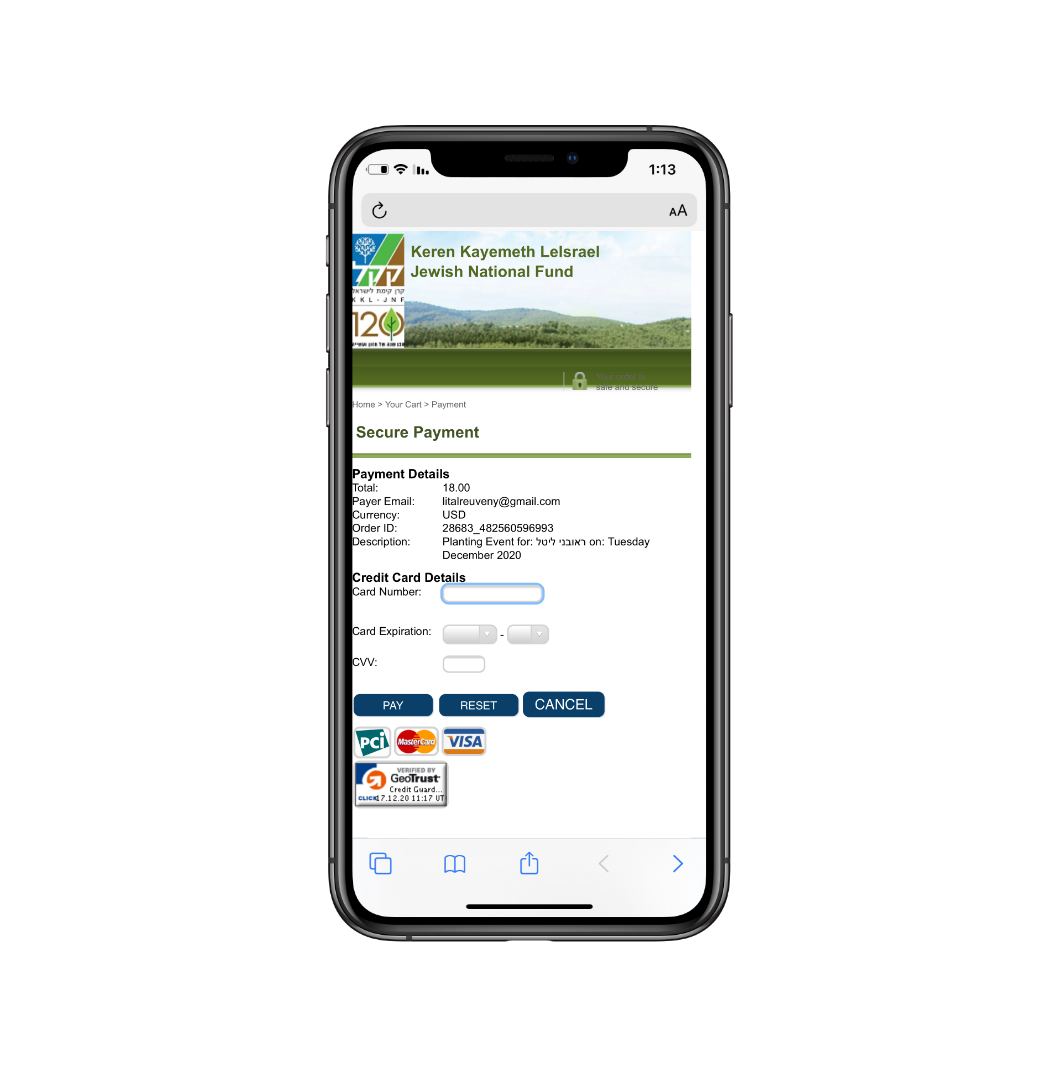
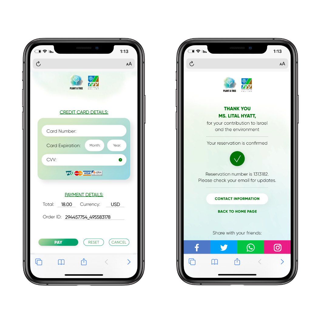
The payment page that has been used so far (on the left side) does not match the current design of the website, and was not very responsive either. A user who reaches this stage may be stressed and panic that this is a hacked and untrustworthy website. In addition, there is no differentiation between the important "pay" button and the other buttons. It seems that the "cancel" button is the main and prominent button, which may cause the user to not proceed with the payment.
It was important for me to adapt the payment area to the “graphic language” and give the user a secured feeling.
Finish Page
In the previous version of that page, the user did not receive any "success" message on the website informing him that his order was approved. Instead they were just sent to the home page. This screen assures the user that the order has been completed successfully, and also provides important information that they will need without getting a feeling of uncertainty as to whether the transaction was completed or not.
Old version:
New version:
New Screens
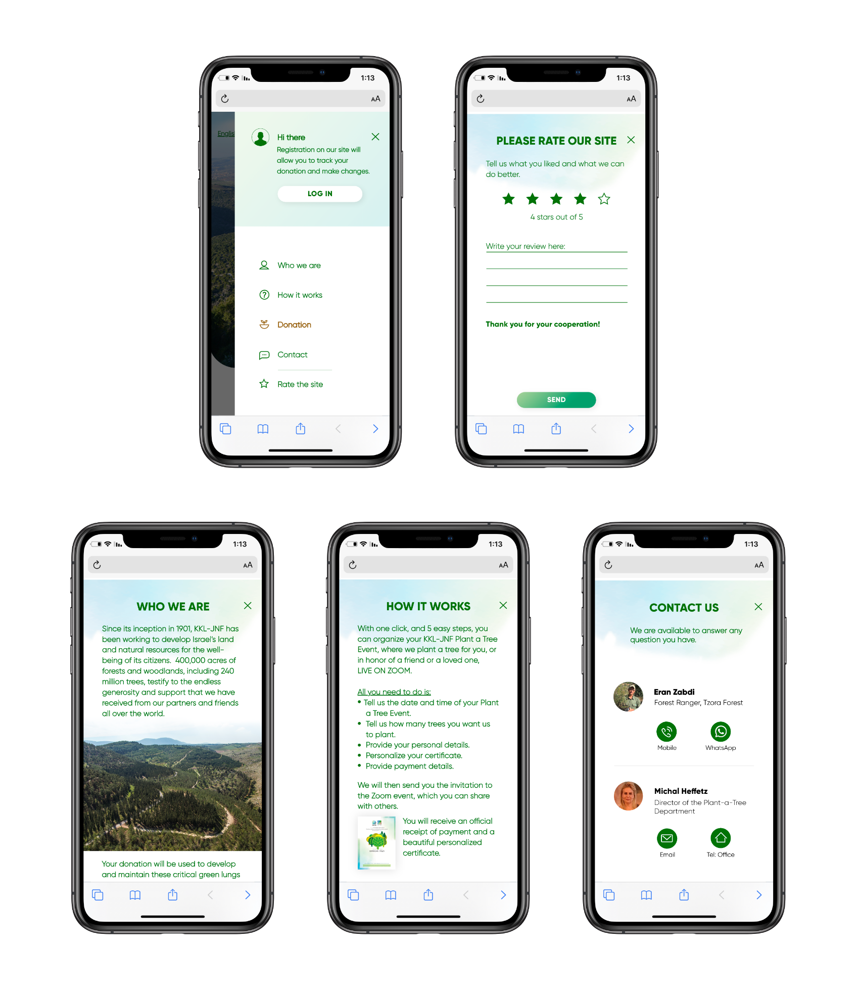
The “hamburger” menu didn’t exists, as well as the information inside of it.
Adapting the platform to the Corona period
Following the Covid-19 outbreak, changes were made to adapt to the new situation in the world. The most notable changes were that the user would not be able to come and plant the seedling themselves, so there was no need for them to choose where to plant the seedling on the website. This led me to ask for fewer details about the user, such as the number of people coming to the planting and the number of children versus adults.
An example of the map presented before the corona virus:
Old version:
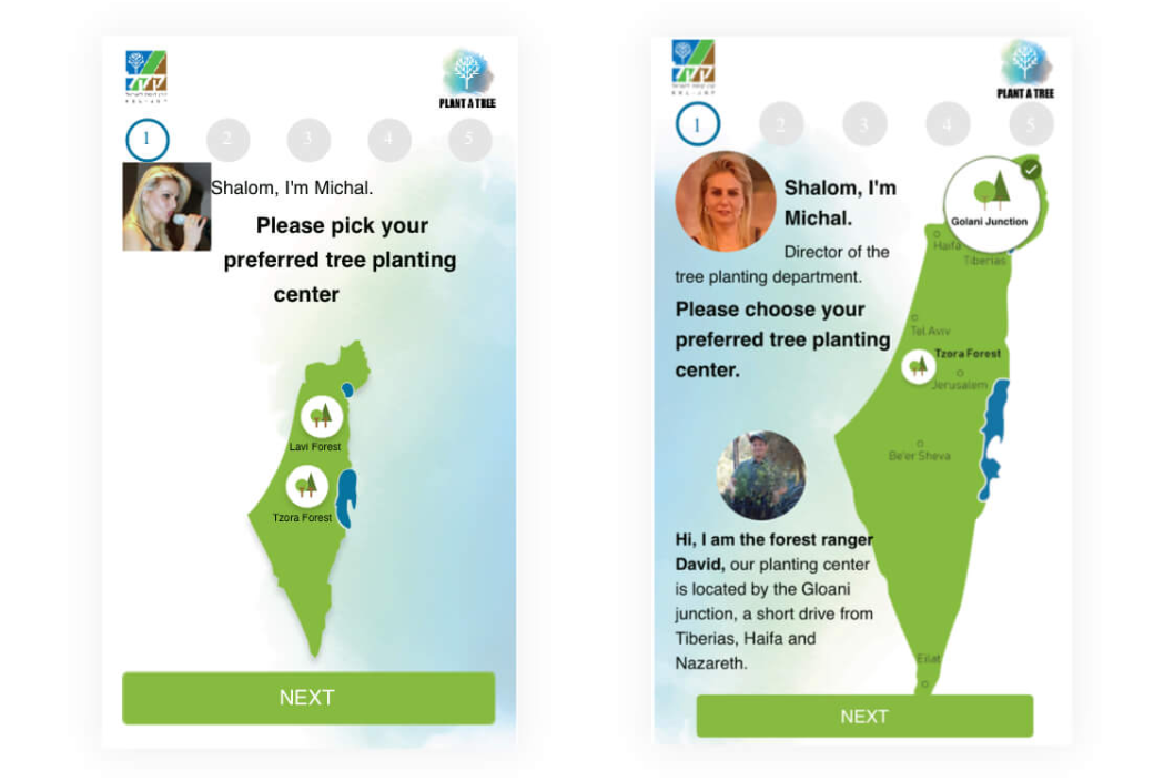
One confusing aspect of this step in the old design was the "Next" button. During user research sessions, I observed that many users would not actually read what was on the screen and would reflexively hit the "Next" button immediately. In my version of this step, I removed the "Next" button completely to focus the user on the main task at hand: selecting a tree planting center. With this change, the user more clearly understood that they needed to choose one of the two tree planting centers before moving on.
I completed this work during my time at Keren Kayemet Leisrael – Jewish National Fund.
